This post is about a few different ways that you can improve the experience someone has while they’re waiting for the images to load on your web site or application.
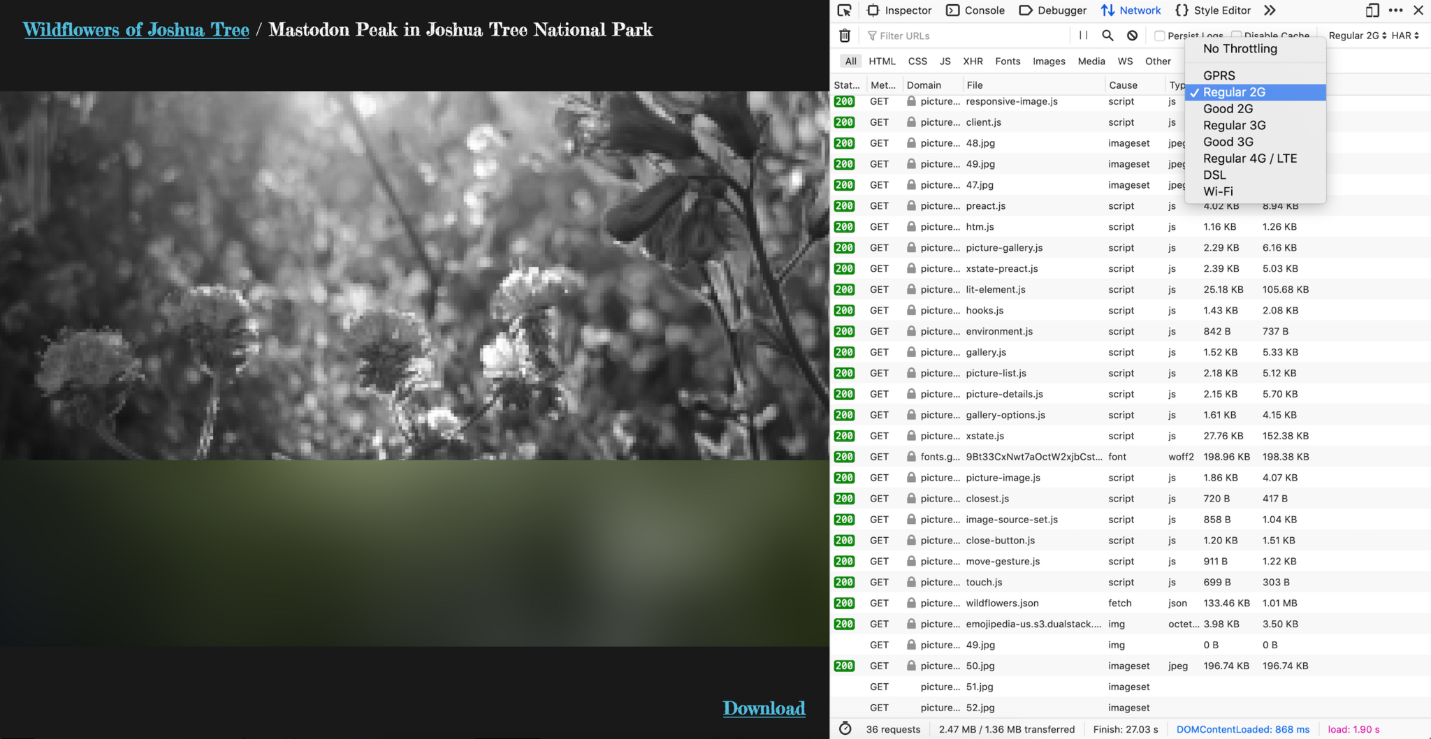
You can see a demo of these techniques by switching on network throttling in the developer tools for Firefox or Chrome, and then visiting this wildflower picture gallery:
Wildflowers of Joshua Tree (demo)
There are five ideas suggested here, but don’t feel like you have to use all of them! Some will be way more useful in certain contexts (especially lazy loading), and implementing even just one can make a big difference. In general, these techniques are useful for large images, long lists of images, and images that affect the layout of a web page.
- Loading images lazily
- Giving images an intrinsic size
- Making a variety of image sizes available for differently sized screens
- Showing a preview of each image
- Making image descriptions available
Loading images lazily
This technique involves only loading images if they’re within the viewport or likely to be within the viewport the next time the user scrolls up or down. It’s super useful when applied to a list of images, where only a few are visible at a time.
This should make the first few images a user is looking at load more quickly–particularly on a slow connection. It may also save bandwidth and some dollars for users of your web product.
You can easily begin using the lazy loading technique, now that it’s built into the web platform:
Native Lazy Loading on CSS Tricks
<img loading="lazy" />
And if it’s not yet implemented in a browser that you feel is important to your audience, you can manually apply the technique by following a guide like this one, from Google:
Lazy Loading Images and Video, Web Fundamentals by Google
Giving images an intrinsic size
This will help browsers to lay out the page completely while the images are still loading, since it will know how wide and tall each image should be. Basically all you have to do is add a width and height attribute to each image and the browser will take care of the rest. You can learn more about it with this guide from Mozilla:
Media container elements and aspect-ratio, by Mozilla
<img width="1500" height="1000" />
img {
  max-width: 100%;
  height: auto;

  /* Browsers like Firefox now have a default rule like this one
    (so you don’t have to write this line, but it looks neat!) */
  aspect-ratio: attr(width) / attr(height);
}
If you have a lot of images, you can use a tool like node-exif to automatically make the image sizes available to you as data.
"exif": {
  "ExifImageWidth": 1500,
  "ExifImageHeight": 1000
}
Making a variety of image sizes available for differently sized screens
Similar to lazy loading, this will make images load noticeably faster on slow connections and saves bandwidth for users and servers–and potentially some dollars for your audience and yourself.
You can get started by adding a srcset attribute to your image element and giving it a few image sizes at different widths. If you want to go further, adding a sizes attribute can make a big difference in download size too.
<img
  src="
    /images/500-wide/wildflowers.jpg"
  srcset="
    /images/500-wide/wildflowers.jpg 500w,
    /images/1000-wide/wildflowers.jpg 1000w,
    /images/1500-wide/wildflowers.jpg 1500w"
  sizes="
    (min-width: 35em) 50vw,
    100vw"
/>
The srcset attribute above is basically saying to the browser, “Hey! I have three different images for you to choose from, ranging from 500 pixels wide to 1,500 pixels wide. Please choose whichever one is best for your viewport size and device pixel ratio.”
And the sizes attribute is saying, “I’ve included a CSS layout for this page that makes images either 50 or 100 percent of the viewport width, depending on how wide the viewport is. Please consider this information too when you choose one of the srcset images. I’m telling you this information now–since you’re awesome and you have a lookahead preparser that needs this information to be stored somewhere in the HTML.”
img {
  width: 100vw;
  height: auto;
}

@media (min-width: 35em) {
  img {
    width: 50vw;
  }
}
Be sure to keep the src attribute that you already have on the img element. This will provide a default image for browsers that don’t understand the srcset syntax. Any size image will be a good choice–even a big one. (Modern browsers will skip the srcimage and download a potentially smaller image from the srcset instead.)
If you have a lot of images, you can use a tool like GraphicsMagick to automatically generate differently sized images. Or you can use a service like Netlify Large Media.
You can learn more in the Responsive Images guide from Mozilla or by listening to this Implementing Responsive Images podcast with Jen Simmons and Jason Grigsby.
Showing a preview of each image
This practice is about making images appear to load faster, by showing a colorful preview of each image while it’s loading.
The “Blur Up” Technique for Loading Background Images on CSS Tricks
If you’re already creating differently sized images for use in the responsive images technique, you can easily generate one more tiny sized image for use as a preview. I found that a 16 pixel wide image works well–especially after it’s optimized with a tool like ImageOptim.
Once you have your tiny images, you can embed them directly in the HTML for your page using data URLs.
<img class="preview" src=" data:image/jpeg;base64,/9j…EKyONpWJGxwSAuDj5qPEXQxv/9k=" />
<img src="/images/wildflowers.jpg" />
img.preview {
  filter: blur(100px);
}


Making image descriptions available
Most browsers display the description stored in the alt attribute while the image is loading.
<img alt="A lush group of plants with purple flowers, growing in the sunshine" />

Descriptions are also super important and helpful for people who experience your web product using tools like Voice Over.
If you have a lot of images, you may be able to get a head start writing descriptions by using something like machine learning. (I haven’t done this before myself, but would really like to try it!)
An example project
Here’s a project on GitHub that makes use of each of these techniques, that you can use a reference or starting point:
The project also contains example code for automatically generating images and width and height data.
More tips
There are, no doubt, many more ways to improve the user experience while loading images on the web. If you have a tip I didn’t mention or an easier way of accomplishing any of the ideas above, please feel free to comment. 🙂
